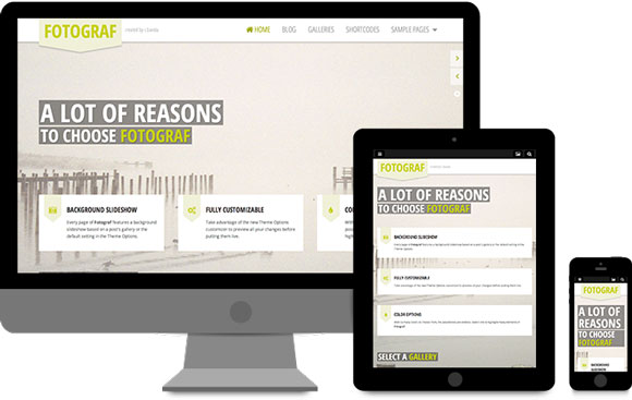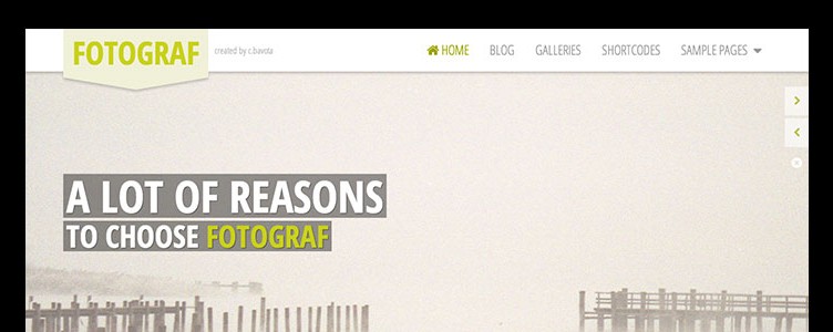
Fotograf was built to look amazing on any device. To see it in action, resize your browser window and you will see how things adjust accordingly. If you shrink it down to a handheld device width, you will see the mobile menu appear for easier navigation on any smart phone. Having a responsive website for easy accessibility by any user is a must and Fotograf has you covered.
